


Photo via Pantone
‘A more hopeful future’ is a quote from Pantone when they announced their new Color of the Year for 2021. Actually Pantone announced that they chose two colors Illuminating 13-0647 and Ultimate Gray 17-5104. I do not know what to think about these choices from the Pantone Color Institute which is the leading fashion and home authority. Pantone says Ultimate Gray represents the practical, resilient mindset demanded by the pandemic, white its sunshiny counterpart expresses optimism for the future. I certainly understand the idea of optimism in 2021 but the bright yellow seems a bit jarring to me and the medium gray is kind of boring. A few months ago I highlighted in my blog the Sherwin Williams Color of the year, Urban Bronze which I really like. Of course the goal of these companies is to ultimately influence Interior Designers but I do know that they do have an understanding of the national psyche before they make these announcements.
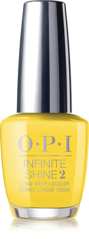


Photo via OPI
With this in mind, I decided to do a bit of research of my own. The Illuminating yellow color I see often in clothing fashion and most often I see it as a finger nail color. OPI has a great polish called Infinite Shine. This is a beautiful color for the tips of your fingers and looks great on most skin tones. I do not think Ultimate Gray would work well unless it was a few hues lighter or combined with some sparkly glitter.
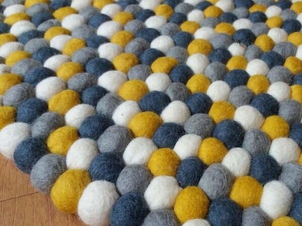


Photo via Etsy vendor Felt and Rugs
One area that I do see the Pantone recommended combination is in home accessories. I found the above area rug on an Etsy listing. I cannot speak to the longevity of the product but the addition of white and dark gray are really fun. Adding the darker and lighter color seems to calm the juxtaposition of the Illuminating bright yellow and medium toned Ultimate gray. As an interior designer I would use this rug in a kid’s room or a casual family room.
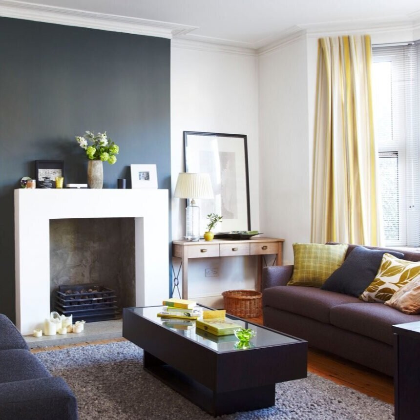


Photo via Sussie and Bell
Along this theme of using these two Pantone colors with other tranquil neutral colors check out the photo above. I really like the yellow drapery panels, pillows and accessories mixed with the fireplace darker gray accent wall and cocktail table. The Ultimate gray in the area rug combined with the shag texture make the space less formal and fussy. The white ceiling, molding and wall produce a great resting area for your eyes. I am not a fan of the wood tone sofa table or basket and would exchange them for a glass or acrylic table and a black storage box.
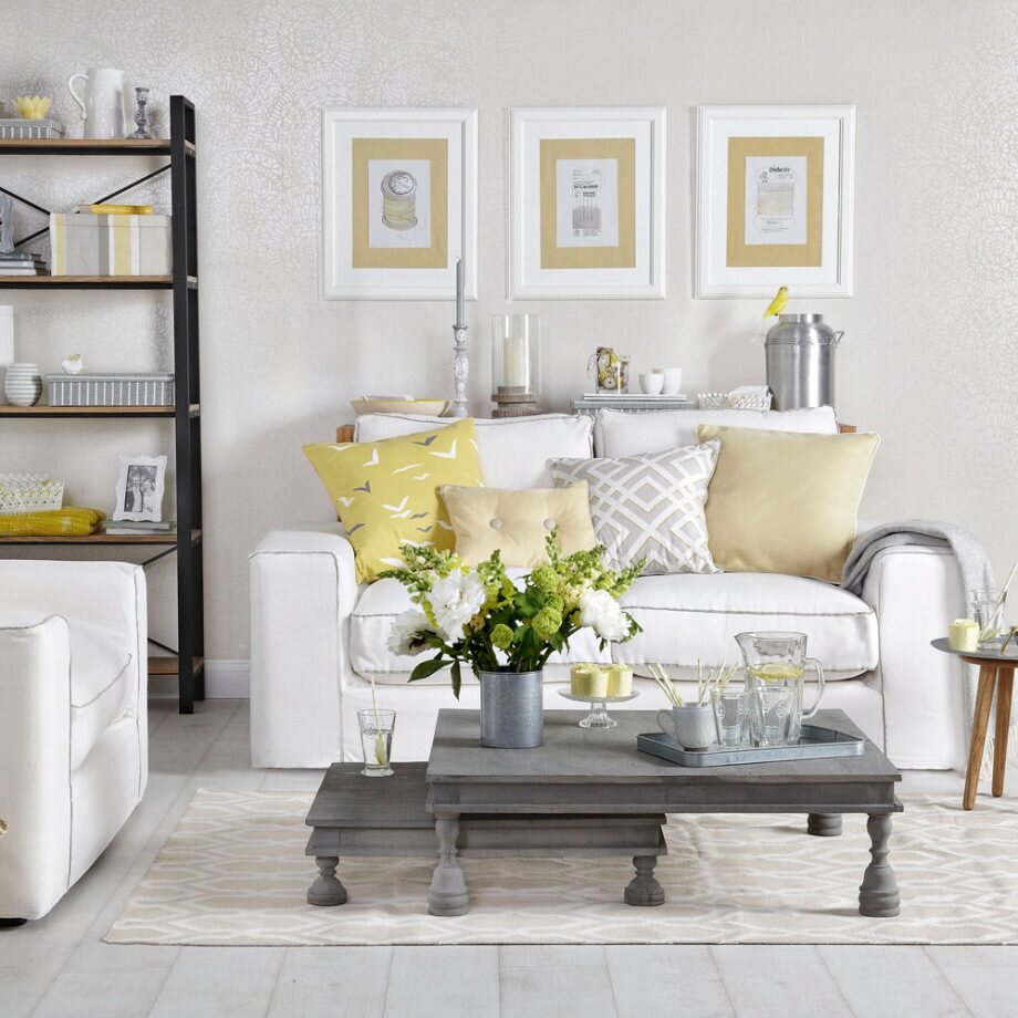


Photo by Simon Scarboro
Lastly here is a room with a similar theme but done with an opposite style. The yellow and gray tones are soothed with the addition of white sofa and cream chair. Instead of bright yellow paint, serene wallpaper is used with a floral pattern which is much more peaceful than bright yellow Pantone suggests. Also, the walls are painted with a wonderful light gray rather than the darker gray. If you are intrigued with the Pantone Color(s) of Year for 2021, please give me a call to discuss how we can work together to create a great space.
Julie
First Impressions by Julie Wagner
http://www.impressionsbyjulie.com/
https://g.page/firstimpressionsbyjulie?share
https://www.yelp.com/biz/first-impressions-by-julie-wagner-chapel-hill-3


